The ideal line length for readable text is 50–75 characters per line (CPL), with 66 CPL being the sweet spot. This range helps reduce eye strain, improves comprehension, and ensures a smooth reading experience. Lines that are too long or too short disrupt reading flow, making content harder to follow.
Here’s what you need to know:
- Why it matters: Proper line length supports natural eye movement and focus. Long lines cause fatigue, while short lines break reading rhythm.
- Best practices: Use 50–75 CPL for body text, with adjustments based on font size, typeface, and screen size.
- Accessibility tips: Follow WCAG guidelines by keeping lines under 80 characters for non-CJK languages and 40 for CJK scripts.
- Responsive design: Adjust line length for mobile (30–50 CPL) and desktop (45–75 CPL) for better readability.
- Key CSS tools: Use
max-widthinchunits and relative font sizes to maintain consistency across devices.
Proper line length isn’t just about aesthetics – it ensures content is easy to read, accessible, and user-friendly. Keep these principles in mind to create layouts that engage and inform effectively.
The right Line Length & Line Height in Typography
Core Principles of Ideal Line Length
Now that we’ve touched on readability, let’s dive into the specifics of what makes line length so important. Research in typography and human reading behavior provides clear guidelines for creating text that’s easy on the eyes and the brain. Below, we unpack the key metrics and how they influence the reading experience.
The 50–75 Character Rule
The 50–75 character rule is a cornerstone of readable text. This range is widely recognized as the point where readers can comfortably process information without feeling overwhelmed or interrupted. Within this range, 66 characters per line is often cited as the sweet spot.
"Anything from 45 to 75 characters is widely regarded as a satisfactory length of line for a single-column page set in a serifed text face in a text size."
- Robert Bringhurst, 1992
Interestingly, reader skill level can shift these numbers slightly. For instance, novice readers tend to perform best with 34–60 characters per line, with 45 being ideal. On the other hand, expert readers are more comfortable with slightly longer lines of 45–80 characters, with 60 being their optimal range.
This count includes everything visible on the line – spaces, punctuation, and characters.
How Line Length Affects Reading and Eye Movement
Line length isn’t just about aesthetics; it directly impacts how our eyes move across the page and how smoothly we process information. When text falls within the optimal range, readers benefit from natural eye movements that make reading feel effortless.
Research highlights that a medium line length of 55 characters per line supports effective reading across various speeds.
"A medium line length (55 characters per line) appears to support effective reading at normal and fast speeds."
- Dyson & Haselgrove
Shorter lines are better for accuracy, making them ideal for detailed reading. Meanwhile, longer lines are more suited for quick scanning, which helps when readers are searching for specific information.
However, straying too far from the optimal range can disrupt the reading experience. Lines that are too long often lead readers to skim along the left margin rather than fully engaging with the text. This behavior reduces comprehension and undermines the effort put into creating quality content.
For context, adults reading English silently average 238 words per minute for non-fiction and 260 words per minute for fiction. Poor line length choices can slow these rates and increase the mental effort needed to understand the material.
Adjusting Line Length for Different Fonts
The type of font you use also plays a big role in determining the ideal line length. A one-size-fits-all approach won’t work here – font size, typeface design, and line height all need to be factored in.
- Font size is the most obvious variable. Start with a comfortable size and adjust the line length accordingly. For web pages, the ideal range can stretch to 45–85 characters per line, depending on the font size.
- Typeface design influences how many characters fit comfortably on a line. Fonts with condensed letterforms allow for more characters per line, while wider fonts need fewer characters to remain readable.
- Line height should increase as line length grows. Longer lines require more vertical spacing to help readers transition smoothly from the end of one line to the start of the next. A good rule of thumb is to set line height to around 150% of the font size.
The language of your text also matters. For example, English has shorter average word lengths compared to some languages, which affects how many characters per line work best.
Finally, think about the reading context. Shorter lines are better for casual reading, while slightly longer lines work well for scanning or more focused tasks. Responsive design adds another layer of complexity, as line length must adapt across various screen sizes. Testing your typography on smaller devices ensures a good balance between line length, font size, and line height.
How to Apply Ideal Line Length in Digital Design
Now that you’re familiar with the basics of optimal line length, let’s dive into how to put these principles into action. With modern web development tools, you can create responsive typography that works seamlessly across different devices.
Using CSS for Responsive Typography
CSS offers powerful tools to control line length and adapt typography to various screen sizes. For example, the ch unit, which represents the width of the "0" character in the current font, is great for setting line lengths based on character count. The clamp() function allows you to define minimum, preferred, and maximum values, offering flexibility. Viewport units (vw, vh, vmin, vmax) further help scale typography relative to the screen size, while media queries can apply specific styles for different devices.
Here’s a practical example:
.content { max-width: 66ch; /* Targets the ideal 66 characters per line */ margin: 0 auto; } And for font scaling:
font-size: clamp(32px, 4vw, 48px); It’s also important to use relative units like rem and test text scaling to ensure compliance with WCAG 1.4.4 accessibility standards.
Now, let’s look at how to fine-tune these techniques for both desktop and mobile designs.
Setting Line Length for Mobile and Desktop
The optimal line length varies depending on the device. For desktop screens, aim for 45–75 characters per line, with 66 characters being the sweet spot for extended reading. To achieve this, use a column width of around 20–25 rem and pair it with a line height between 1.3 and 1.45, depending on your typeface.
On mobile, shorter lines are necessary due to limited screen space. Aim for 30–50 characters per line to maintain readability. A minimum font size of 14–15px ensures text remains clear and legible.
Here’s a quick reference:
| Device Type | Optimal Line Length | Font Size Minimum | Line Height |
|---|---|---|---|
| Desktop | 45–75 characters | 16px+ | 1.3–1.45 |
| Mobile | 30–50 characters | 14–15px | 1.3–1.5 |
Remember, longer lines benefit from increased vertical spacing to guide the reader’s eye, while shorter lines can work with tighter spacing.
Testing Line Length with UXPin
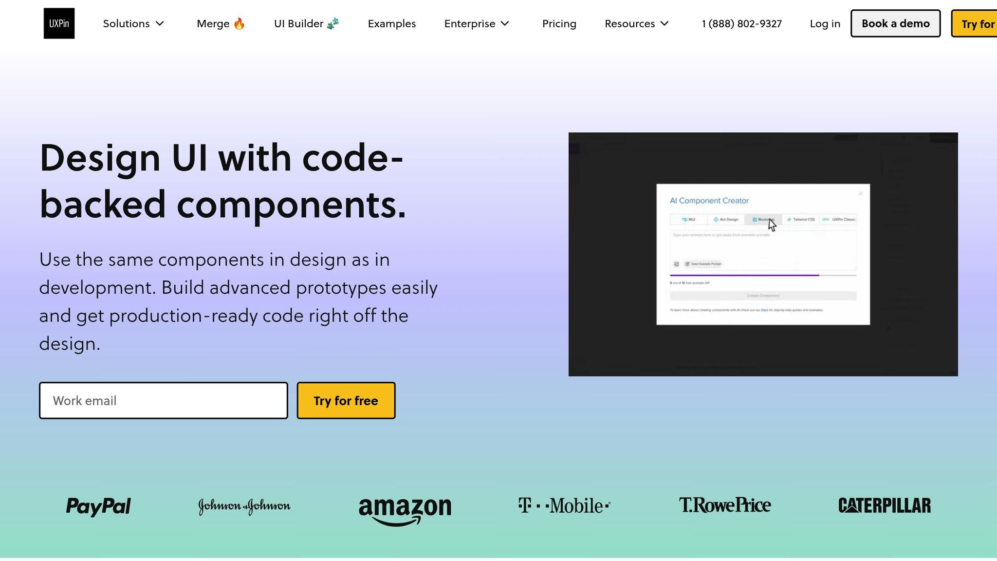
Once you’ve set up your typography for different devices, it’s time to test your design. Prototyping tools like UXPin make it easy to validate and refine line length across various devices and breakpoints. The platform’s responsive design features let you see how your typography performs in real-time.
With UXPin, you can use interactive breakpoint testing to catch line length issues early. Its code-backed prototyping ensures that your typography settings translate directly into development. Features like the AI Component Creator can even help you generate typography components with ideal line length settings. By testing your layout with real content in UXPin, you can spot potential readability problems early and ensure a smooth user experience on all devices.
sbb-itb-f6354c6
Accessibility and Compliance for Line Length
Getting the line length right doesn’t just improve readability – it’s a key factor in making content more accessible and user-friendly. This section dives into how you can meet accessibility standards while enhancing usability for everyone.
WCAG Guidelines for Line Length

The Web Content Accessibility Guidelines (WCAG) recommend keeping text lines to a maximum of 80 characters for non-CJK languages (like English), while Chinese, Japanese, and Korean text should stay under 40 characters per line. These limits are essential for ensuring readability and achieving compliance.
"The intent of this success criterion is to ensure that visually rendered text is presented in such a manner that it can be perceived without its layout interfering with its readability." – Understanding WCAG 2.0
When text lines are too long, readers often experience fatigue because their eyes must work harder to track from the end of one line to the start of the next. To stick to these guidelines, you can use CSS with font-relative units. For example, setting the max-width property to 70ch or 34em helps keep text within the ideal range. Adjust these settings based on your chosen font to ensure readability.
Additionally, allow users to adjust text spacing by using relative units for reflow. These adjustments not only help meet accessibility standards but also cater to specific user needs, as discussed below for individuals with dyslexia.
Line Length for Dyslexic Users
For readers with dyslexia, maintaining the right line length is even more critical. The British Dyslexia Association suggests aiming for 60–70 characters per line to improve readability.
"The Web Content Accessibility Guidelines (WCAG) 2.1 and the British Dyslexia Association suggest keeping line lengths to 80 characters or fewer, ideally around 60–70 characters, for optimal readability."
To further enhance the reading experience for dyslexic users, consider these adjustments:
- Use sans-serif fonts like Arial, Verdana, or Open Sans, sized between 12–14 points.
- Increase letter spacing to about 35% of the average letter width.
- Set line spacing to 150%.
- Left-align text and avoid full justification, which can disrupt clarity.
These tweaks make a big difference in reducing visual stress and improving comprehension for dyslexic readers.
Line Length and Screen Reader Compatibility
Accessibility goes beyond visual presentation – it’s also about ensuring compatibility with assistive technologies like screen readers. Properly structured text allows these tools to interpret and navigate content effectively.
Use semantic HTML to maintain a logical reading order and support features like text reflow. For example:
- Use relative units for column widths and font sizes so text adjusts seamlessly when users modify their settings.
- Avoid fixed-height containers to prevent text overflow.
- Test your content with screen readers to ensure that line breaks and formatting don’t disrupt the reading flow.
Incorporating ARIA attributes can further enhance accessibility, but they should complement – not replace – semantic HTML.
"Thus, this is another case where adhering to guidelines written based on accessibility principles will, at the same time, improve the experience for all users, including those without accessibility needs." – Baymard Institute
Testing and Measuring Line Length
After setting up responsive typography in CSS, it’s crucial to test and measure line lengths to ensure your design is readable in real-world scenarios. By systematically validating your choices, you can confirm that your typography enhances readability for users across different devices and contexts.
Tools for Measuring Character Count
Measuring character count accurately is key to maintaining ideal line lengths. Thankfully, there are several tools that can help you track and monitor text metrics throughout your design process.
For quick checks in browsers, tools like Polypane allow you to select text and right-click to view detailed metrics, including the number of characters, words, sentences, and even emojis.
If you’re using design software, Adobe InDesign’s Info panel is another excellent resource. It displays essential text details – like character and word counts – for any selected text, making it easier to maintain consistent line lengths across layouts.
Another simple method is the alphabet test: check if two to three complete alphabets fit on a single line. This quick visual check helps ensure your line lengths remain within the recommended range.
"CharacterCounter gives you the info you need when you need it, getting you back to what you were doing."
– Jason Crabtree
Aim for line lengths between 45 and 90 characters, including spaces. Once you’ve set these parameters, the next step is to gather real user feedback to confirm how these measurements impact readability.
User Testing for Line Length
While character counts provide a good starting point, user testing offers deeper insights into how line lengths affect readability.
By combining observation with quantitative methods – such as reading speed and comprehension tests – you can evaluate how well your typography works. Look for signs of strain, like users leaning closer to the screen or mentioning difficulty reading during testing sessions.
Comprehension tests are particularly useful. These can range from simple memory exercises to more detailed questions about the material users just read. For example, one study showed that rewritten web pages about a complex B2B product led users to recall 65% of the product’s features, compared to only 33% with the original content.
"If users get 60% or more right on average, you can assume the text is reasonably comprehensible for the specified user profile employed to recruit test participants."
– Jakob Nielsen
For content that proves challenging, Cloze tests (where users fill in missing words from a text) can help pinpoint areas where line length adjustments might improve comprehension. Once you’ve gathered these insights, ensure they hold true across all platforms and devices.
Testing Line Length Across Browsers and Devices
To ensure consistent line lengths, cross-device and cross-browser testing is essential. What looks perfect on your design software might appear differently on actual devices.
Test on real smartphones, tablets, and desktops instead of relying solely on browser simulation tools. Focus on popular screen resolutions and test in both portrait and landscape modes.
Additionally, check how your typography performs across major browsers like Chrome, Firefox, Safari, and Edge. For example, BrowserStack’s Real Device Cloud significantly reduced testing time for Optimizely, cutting a full day of work by eight engineers down to just one hour. While Chrome Developer Tools can help with initial testing, final validation on actual devices is critical. Testing under varying network speeds can also help identify font-loading issues that might disrupt your layout.
"Typography is more art than science, all my advices here are guidelines base on my experiences as a UI designer for the past 15 years. In the end, always make your own decisions."
– Oliver Schöndorfer, UI Designer
Tools like UXPin’s prototyping environment allow you to test line lengths early in the design process. By creating interactive prototypes that simulate different screen sizes, you can catch potential problems before development begins.
Thorough testing and measurement of line lengths are essential steps in creating typography that is both accessible and visually appealing.
Key Points for Line Length Optimization
Mastering line length optimization involves blending foundational principles with practical strategies to enhance digital readability.
Line Length Best Practices Summary
Start with the 50–75 character rule – this range strikes the perfect balance for comfortable reading. It minimizes eye strain and helps users maintain their place when moving between lines.
Adhere to WCAG 1.4.8 guidelines, which recommend limiting text lines to 80 characters (or 40 for CJK scripts). This standard is especially helpful for users with dyslexia or other reading challenges, making digital content more accessible.
Use CSS properties to maintain consistent line lengths across devices. The ch unit is particularly useful because it adjusts automatically based on the width of the "0" character, accommodating different fonts without manual adjustments.
Context matters. On mobile devices, portrait mode naturally limits line length due to narrower screens, but landscape mode can stretch lines uncomfortably long. For desktop displays, careful attention is needed to avoid overly extended lines that hinder readability.
Line length doesn’t exist in isolation – it works in tandem with other typographic elements. For example:
- Line height should be about 150% of the font size, aligning with WCAG’s recommendation of at least 1.5 times for better accessibility.
- Paragraph spacing should be at least twice the font size.
- Letter spacing should be at least 0.12 times the font size, and word spacing at least 0.16 times.
"Reading a long line of type causes fatigue: the reader must move his head at the end of each line and search for the beginning of the next line.… Too short a line breaks up words or phrases that are generally read as a unit." – James Craig, Designing With Type
By following these principles, designers can create text layouts that are both functional and visually pleasing.
Practical Tips for Designers
Ready to apply these ideas? Here are actionable tips to help you integrate line length optimization into your design process.
Start with content, not containers. Determine a comfortable font size first – 16pt for most screens and 32pt for larger displays like TVs. Then, aim for a line length of 50–75 characters to ensure readability.
Use fluid typography. Instead of relying on fixed breakpoints, implement CSS techniques that allow font sizes and line lengths to scale smoothly with screen dimensions. This creates a seamless reading experience across devices and avoids abrupt changes in layout.
Break up long content. For extensive text, use tools like bullet points, subheadings, and visual breaks to ease reader fatigue. Keep paragraphs focused on one idea to make information easier to digest.
Test with real content. Placeholder text like "lorem ipsum" won’t reveal how your actual content will perform. Use real headlines, body text, and captions during the design phase to catch potential issues early.
Leverage prototyping tools like UXPin. Create interactive prototypes that simulate different screen sizes and content scenarios. Testing line lengths in realistic contexts during the design phase can help identify and resolve readability problems before development begins, saving time and improving user experience.
Adapt for different languages. English often uses shorter words than languages like German, which may require slightly longer line spacing. For accessibility, test your designs at 200% zoom to ensure readability for users who resize text.
Offer user customization. Whenever possible, allow users to adjust font sizes, background colors, and line spacing. This flexibility acknowledges individual preferences while maintaining the overall structure of your design.
The secret to effective line length optimization is treating it as a continuous process. Regular testing, user feedback, and iterative updates will ensure your typography evolves to meet changing needs, keeping your designs functional and reader-friendly over time.
FAQs
What is the ideal line length for readability, and does it vary between beginners and experienced readers?
The perfect line length for reading comfort varies depending on the reader’s familiarity with the content. For those just starting out, shorter lines – ideally between 34 and 60 characters (with 45 being the sweet spot) – are easier to navigate. These shorter lines help minimize eye strain and make it simpler to stay focused. On the other hand, seasoned readers can handle longer lines, stretching up to 80 characters, as they’re more adept at absorbing larger chunks of information without losing track.
Tailoring line length to match your audience’s needs can make a big difference, especially in digital settings. Experimenting with different lengths during the design phase can help ensure your content is easy to read for everyone.
How can I use CSS to ensure text remains readable across different devices?
To make sure your content looks great and is easy to read on any device, try these CSS tips:
- Limit line length: Use
max-width: 70ch;to keep text lines around 70 characters. This length is ideal for comfortable reading. - Flexible font sizes: Use viewport units like
vwor combine them withcalc()(e.g.,font-size: calc(16px + 0.5vw);) so text adjusts smoothly with screen size. - Use media queries for adjustments: For smaller screens, tweak typography using media queries. For instance:
@media (max-width: 768px) { body { font-size: 16px; } }
By applying these techniques, your text will remain clear and readable, no matter the screen size or resolution.
What is the best line length for improving readability, especially for readers with dyslexia?
For readers with dyslexia, keeping lines up to 45 characters long is suggested to minimize visual tracking difficulties. For broader readability, a line length of 50 to 70 characters works well, providing a comfortable balance for most readers.
To make text even easier to read, use 1.5x line spacing, stick with left-aligned text, and steer clear of all caps. These small tweaks can make a big difference, offering a smoother reading experience for everyone, especially those with dyslexia.

